
Moulton Hot Natives
This responsive web design project for a local
native plant business completely transforms an
Excel spreadsheet into an e-commerce website.
Objective
Responsive Web Design
Timeline
Oct 2023 - present
Role
Product Designer
Team
Client
Research Participants
(Client’s Customers)
Tools
Figma
Figjam
Dovetail
Calendy
Zoom
Before


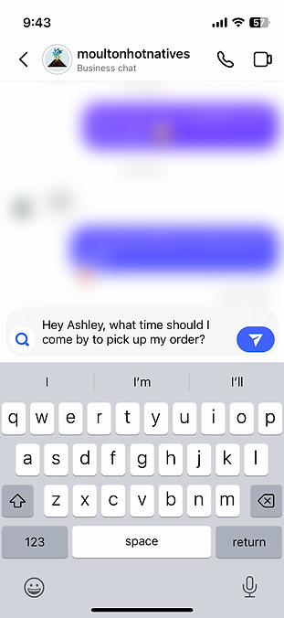

An Excel spreadsheet, Linktree, Instagram and Facebook direct messages, Venmo, email, and other tools are combined to work as the customer’s purchasing process as well as the way the client displays inventory, spreads information, advertises products, and speaks with customers.
Background
Moulton Hot Natives is a small business run by Ashley Moutlon that specializes in growing and selling locally and ethically sourced native seeds and plants to the greater Richmond, VA area. She started her business to improve access to native plants, educate the community, market native plants as desirable, and spread awareness that native plants aren’t just beautiful and low maintenance, they provide food and shelter for animals as well.
Problem
Moulton Hot Natives currently uses many tools (such as Excel, Square, Instagram, and Facebook) to update inventory, make sales, arrange pick ups, talk one on one with customers, spread information, etc. The current setup also requires users to use multiple tools and navigate through many steps to put in orders, decide what plants fit their needs, and educate themselves about native plants.
Solution
Consolidate all the tools onto a single platform, improve the user experience, and create a website that suits her customers’ needs.
Research
Affinity Mapping from User Interviews

To learn more about her customers’ highlights, pain points, and needs, I conducted user interviews with some of her new, longterm, and anchor customers. I asked them questions such as what factors they took into consideration when buying plants, what made Moulton Hot Natives stand out from other businesses, etc. I also conducted a small usability test and asked participants to show how they accessed the spreadsheet and how they decided on what plants to order.
Interview Insights
-
8/8 of research participants prefer using mobile deceives for online shopping
-
4/8 of research participants use both mobile and desktop devices for online shopping
-
8/8 research participants said their motivations for planting native were due to environmental concerns
-
8/8 research participants said that MHN’s use of local ecotype seeds and/or expertise in ecology attracted them to the business.
-
4/8 research participants said they had a hard time imagining what a native plant would look like in a lawn setting
-
5/8 research participants said that they found the plant pairing guides MHN posts on Instagram helpful and think the guides and more expert advice should be on the website
-
5/8 participants found it distracting or inconvenient constantly having to switch between the spreadsheet and other sources/websites to see images of plants and learn more about a plant
These valuable insights defined her customers’ needs, motivations, pain points, and goals to mold a persona.
Define
Persona
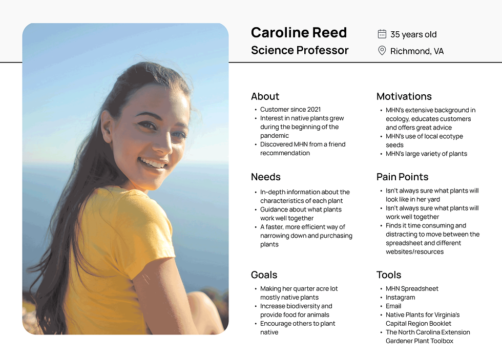
Her customers all had very similar responses regardless if they were a new customer, long term customer, or a contractor. I was able to blend all of their identities into a single persona. Whenever I needed to make major (or small) decisions throughout the project, I referred to the persona and asked myself WWTPD? (What would the persona do?)
Feature Roadmap

I then listed out features that would be helpful based on my affinity map and persona, including additional features to be designed and added to the website later.
Sitemap

For the sitemap, I made sure everything on the spreadsheet, Linktree, and other platforms had a home in the right place on the website. I spent the most time and care working on the plant filtering system, making sure all necessary categories were accounted for since this would be the most complex part of the website.
Task Flows

I then made task flows to figure out what screens would need to be created and what tasks I should have participants do during testing.
Design
Design Patterns & UI Inspiration


I spend a large portion of the beginning of the design process constantly referencing other design patterns to make sure that customers would see patterns they were familiar with and to give it the feel of an e-commerce site. Every time I would design something new I would constantly review multiple sites and see how each one presented a pattern. I took inspiration from each of them, mending the patterns together, creating patterns that suited the customers’ needs and complimented the website.
Low-Fidelity Wireframes


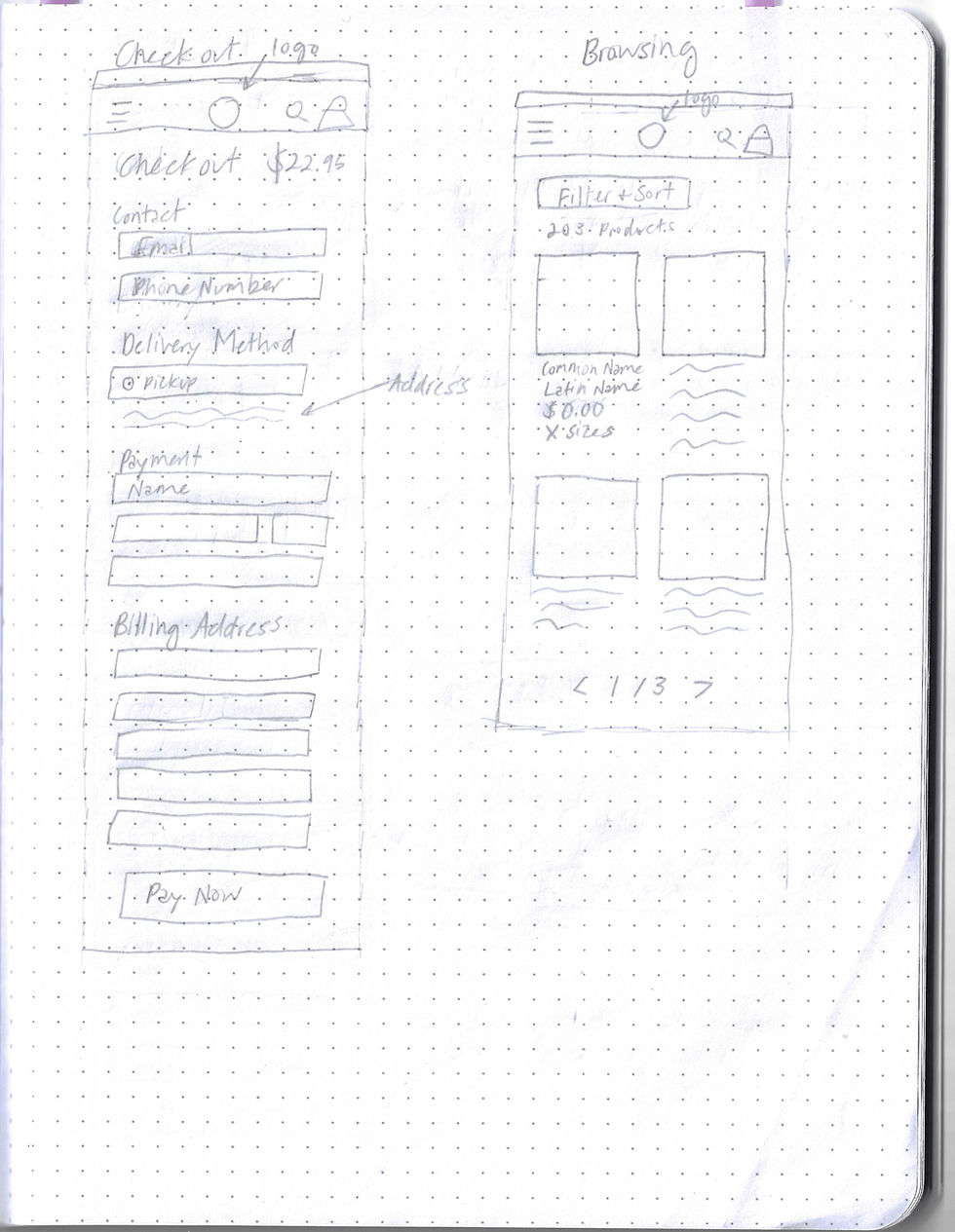
I really took my time with the wireframes, put a lot of thought and care into each sketch, and labeled things clearly so my client could easily understand my thought process. Spending a lot of time collecting design patterns and sketching out screens gave me the solid foundation I needed for solid
mid-fidelity screens.
Mid-Fidelity Wireframes
Mobile Highlights

All Mobile Wireframes

Desktop Highlights

All Desktop Wireframes
While creating mid-fidelity wireframes, I focused on bringing the low-fidelity wireframes to life with the necessary design patterns content. I was not too concerned about hierarchy and text size as some of the texts had to be decreased or increased in size significantly later. I found it helpful to focus on the layout instead of all the bells and whistles too soon.
Branding


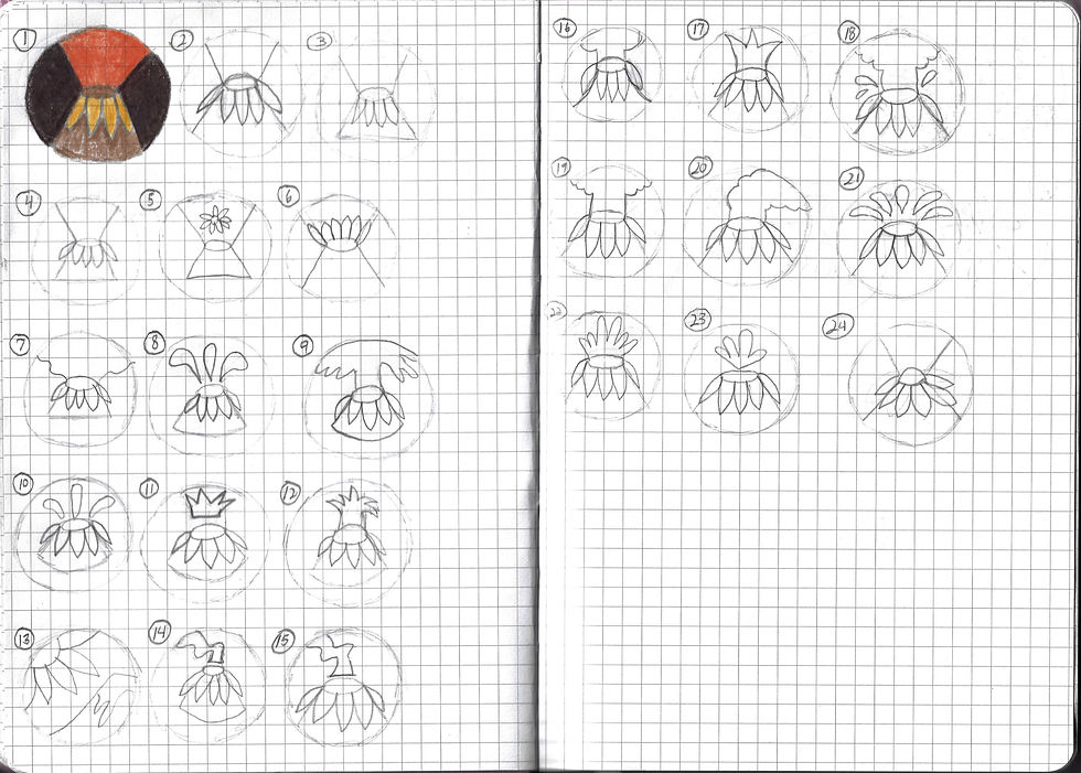

I asked my client to come up with a few key words that described her brand and she came up with “beautiful, badass, academic, smart, and botany.” I then used those words to create a mood board for the website. I aimed to create something that was clean/professional, yet showed off her fun personality and would complete the colorful plant photos. I took inspiration from her original logo and last name “Moulton” and came up with a volcano color palette and logo that was a mix of neutrals with some accents of yellow and orange. This gave the website a bold splash of color while still keeping things looking relatively simple. My client didn’t envision the logo being any of the first sketches I presented her so I created a new set of sketches which she ended up liking.
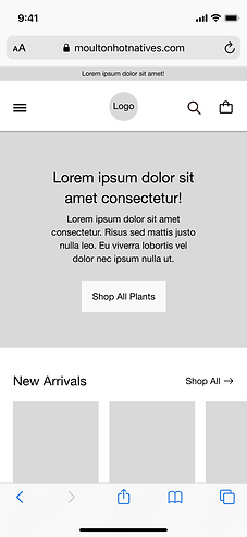
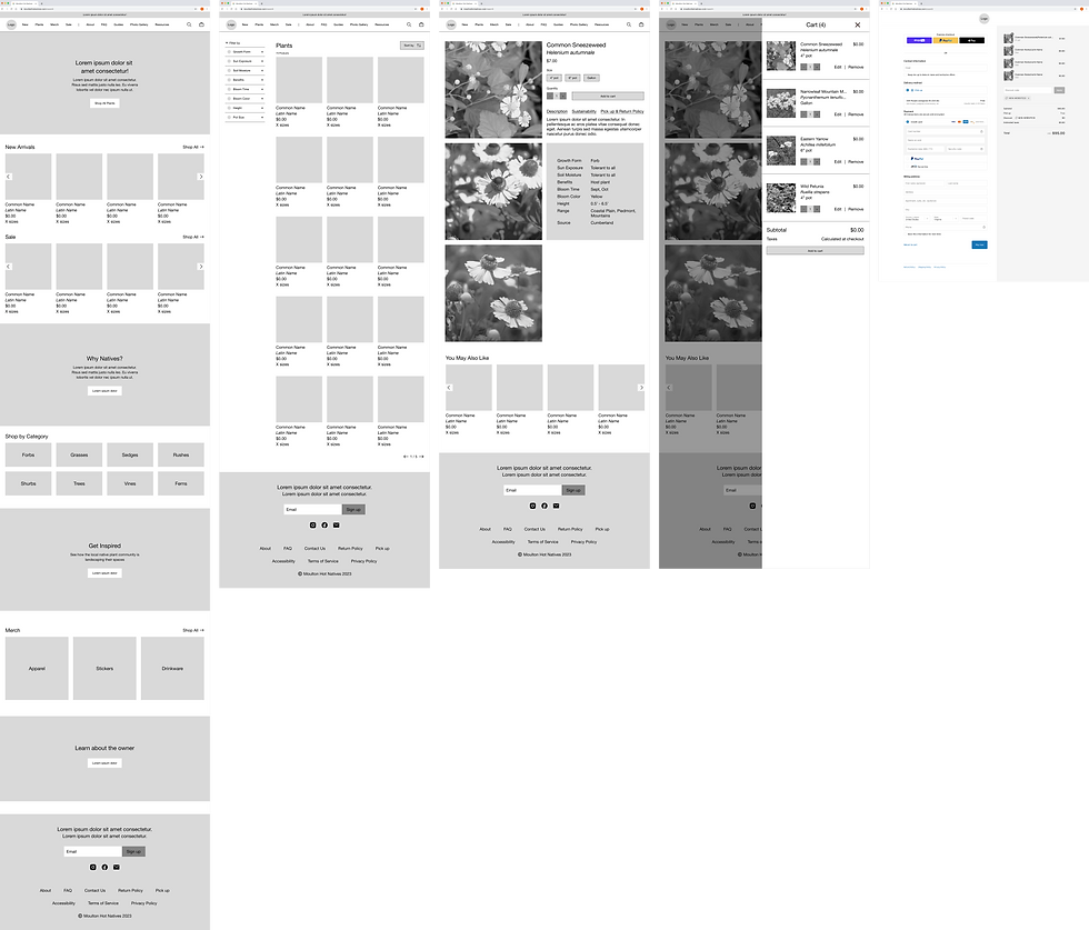
High-Fidelity Wireframes
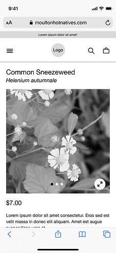
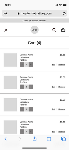
Mobile Highlights


All Mobile Wireframes

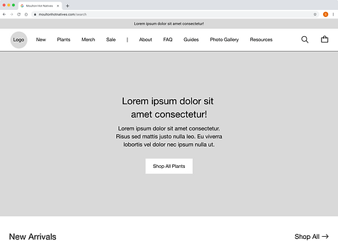
Desktop Highlights


All Desktop Wireframes

Since 100% of research participants preferred online shopping with a mobile device and I would be creating a mobile prototype, I mainly focused on creating the mobile wireframes first then worked on the desktop screens. One of the most important features of the prototype was the filtering system, which was a huge need for the persona. I had never created a filtering system before and I expected it to be super complex and require a lot of thinking. However, my client already had most of the necessary categories within her spreadsheet and playing around with other e-commerce websites’ filtering systems made it much easier than expected.
Test
Usability Testing Results

I typically make a test results chart focusing on suggestions and pain points, however, I was concerned it would appear to my client that customers only had negative things to say about the prototype. So I made a thorough chart displaying all the highlights, suggestions, and pain points users had for my client. Overall, the testing went pretty well, but there were several pain points with the filtering section.
Prioritizing Usability Testing Revisions
-
Update filtering UI to be more user friendly
-
Add information icons to terms users might not know
-
Add “pick up only” to plant pages above add to cart
-
Make benefits more specific on plant page
-
Increase text and image contrast on homepage
-
Rename vague terms such as “guides” and “sustainability”
-
Add more categories and options under filters
-
Change hamburger to back arrow in cart UI
Due to time constraints and being able to do more iterations at a later date, I prioritized revising the filtering system, which all research participants had some pain points with.
Revisions
-
Removed “select all” (unnecessary)
-
Changed "results" to “done”
-
Changed arrow for more consistency
-
Removed right banner icon
-
Moved product results to banner
Before

After

Before Highlights


After Highlights


Conclusion
I am very happy with how the product has turned out so far and my client is as well. Every user that participated in usability testing agreed that the new website is a big step up from the old set up. I’m excited to design the rest of the wireframes and see how the new website changes the business. I am really hoping that it will bring in a lot more business for my client!
Future Considerations
Things I would do differently in hindsight:
-
Do card sorting for the filter categories to create information architecture for the users’ needs
-
Add information buttons and reword terms and phrases that might be unclear to users such as forbs, host plant, keystone plant, etc. Specifically the “sciencey” ones (Many users were unaware of what a forb was during testing, forb - a herbaceous flowering plant other than a grass)
-
Conduct usability testing with more customers
-
Create a simpler color palette
Next Steps
-
Create more screens for the website
-
Do card sorting for filter categories
-
Do more revisions
-
Conduct more usability testing after creating more screens and prototype(s)
-
Source more native plant images

